

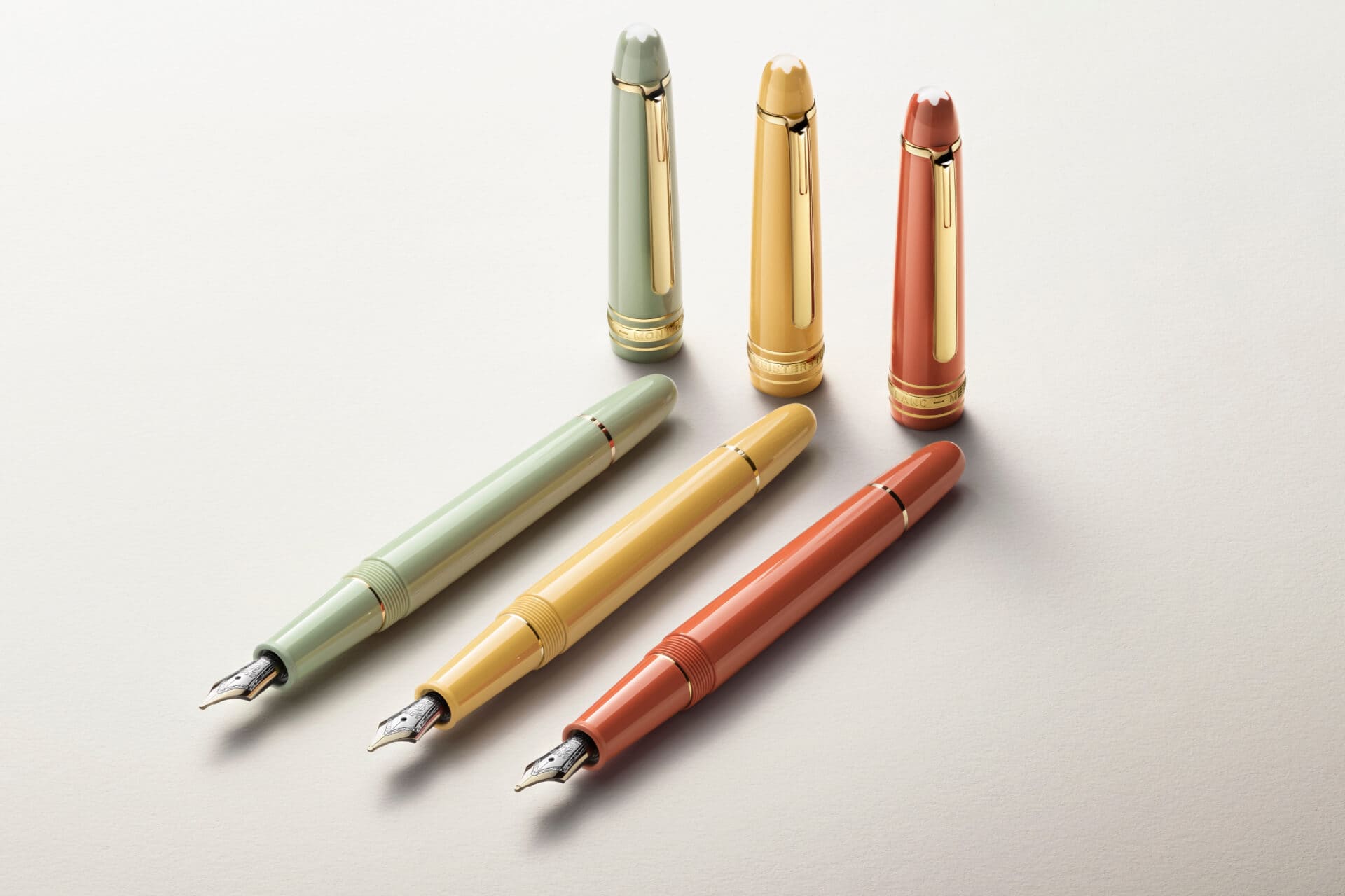
The Meisterstück Bloom trio. Photograph: Montblanc.
Meisterstück in Vermillion, Matcha and Corngold, with “lightness, warmth, and a contemporary spirit”.[1]
Hmm. I think not.
I see a good many people celebrating Montblanc’s Bloom set. I am not one of them. That deserves some explanation, because my objection is not simply that Montblanc has made three brightly coloured pens.
There is nothing wrong with colour, and there is certainly nothing wrong with Montblanc experimenting. But what I want to understand is what this particular experiment gives us, beyond a new palette.
Three colours. The same proposition.
Bloom comprises three Meisterstück Classique fountain pens, with resin bodies and caps, gold-coated fittings and 14-carat gold nibs. They are sold together, accompanied by a leather pouch.[1][2]
The photographs show matching caps, barrels and grip sections in each colour. The gold-coated clips and rings keep the familiar Classique appearance. The colours change its presence considerably; the underlying format remains recognisable.
These are cartridge/converter pens: the Classique can take ink cartridges or draw bottled ink through a removable converter.[3] That is a perfectly workable filling system. It does, however, help locate what is being offered here: three versions of the Classique, rather than three substantially different writing instruments. Bloom is not introducing an integrated piston-filling mechanism or a different pen architecture.
At US$3,900 for the set—the US price checked on 8 October 2026—that distinction matters.[2]
Someone might particularly like the green, or want a warmer-looking Montblanc than the familiar black and gold. But that person is being asked to acquire all three. The set makes sense as a coordinated presentation; it is less persuasive to me as a purchase when the interest might lie in one pen.
Nor does buying three colours necessarily make the experience three times as interesting. The design, format and filling system remain much the same. What changes most visibly is the appearance.
For some buyers, that will be enough. For me, at this level of expenditure, the catalogue deserves a much closer look.
What else could that money buy?
If the intention is to find a Montblanc that looks or feels different, Bloom is hardly the only route.
I would begin with the Writers Edition range. These pens can offer a more developed relationship between their subject and their physical design: the shape, the fittings, the material choices and the details that reward closer examination. Whether a particular edition succeeds is another matter. Some appeal to me much more than others. But there is something substantial to examine beyond the colour.
A Patron of Art edition would also enter the conversation, where an available example and its price make the comparison reasonable. That may require looking beyond the current boutique catalogue. I would compare the particular pen, its condition and completeness, rather than assume that every Patron of Art edition falls within the same budget.
The point is that I would rather put this expenditure towards one more compelling Montblanc. A pen with a design I want to examine, a subject that interests me and a documented limited edition would hold considerably more appeal than three Classiques distinguished principally by their palette.
A number alone does not make a pen worth collecting. But a declared production limit tells us something concrete about the edition. The Bloom product and campaign pages reviewed for this article disclose no numbered edition or production quantity.[1][2] That does not establish unlimited production; it means scarcity cannot presently be part of the case made for it.
Why the Meisterstück name matters
These are not peripheral Montblanc products borrowing a few cues from the Meisterstück. They carry the name itself.
That is where my concern becomes larger than whether I like the colours. To me, the Meisterstück is one of the fundamental designs on which Montblanc’s identity was built. A new release benefits from that recognition before anyone has examined the pen.
Luxury brands need to evolve. They also need judgment about what they continually reinterpret. Making an established icon feel younger or more contemporary is an understandable ambition, but it can become a convenient justification for novelty.
This is where I see the warning signs of dilution. I am not suggesting that one coloured set undoes the Meisterstück. I am questioning whether this release contributes enough to the object to justify what is being asked of its name—and its buyer.
Bloom has made me look. It has not made me want to acquire it.
At this price, I would spend more time elsewhere in Montblanc’s catalogue. A Writers Edition or a suitable Patron of Art would be a far more compelling place for me to begin.
Sources
[1] Montblanc: Meisterstück Bloom campaign. Both photographs: Montblanc.
[2] Montblanc: Meisterstück Bloom Gold-Coated Fountain Pen Set, MB138571. US price checked 8 October 2026.
[3] Montblanc: Writing instrument care; Classique-compatible converter.